A contact form can fail in two ways. Ask too much and people leave before sending it. Ask only for name, email and message, and every enquiry looks the same: you find out who’s serious after a half-hour call. A lead qualification form fixes both: it asks little, but exactly what you need to know before talking.
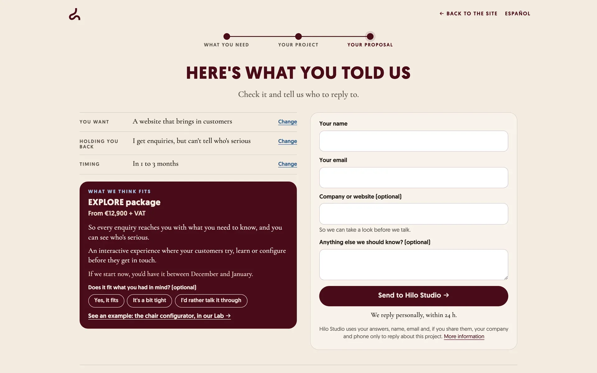
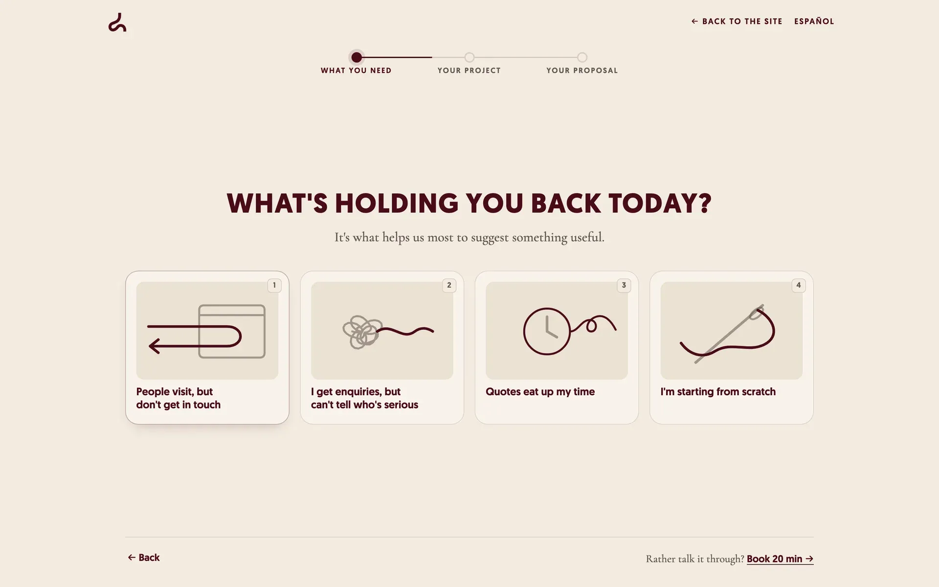
Ours is on our own website. Try it here: three one-tap questions, and at the end we tell you what fits and what it costs. None of your details reach us until you type your name and email.
What qualifying a lead means
Qualifying means knowing, before the first call, what the person wants, whether the cost fits and when they need it. That tells you how to prepare the call, or whether you need one at all.
It isn’t grading. Many systems score leads A, B or C by adding points for budget or urgency. We tried it and dropped it: with a handful of leads a month you answer them all anyway, and the grade was misleading, because it added points for urgency even when the budget didn’t reach. What helps is a notification that arrives with what decides the call, well ordered.
The three questions we ask
| Question | Why we ask it | What it changes |
|---|---|---|
| What do you want to achieve? | It matters most, so it goes first, while attention is fresh. | The recommendation and the options in the next question. |
| What’s holding you back today? | It talks about their problem, not our catalogue. | The line we reply with, and what our proposal is for. |
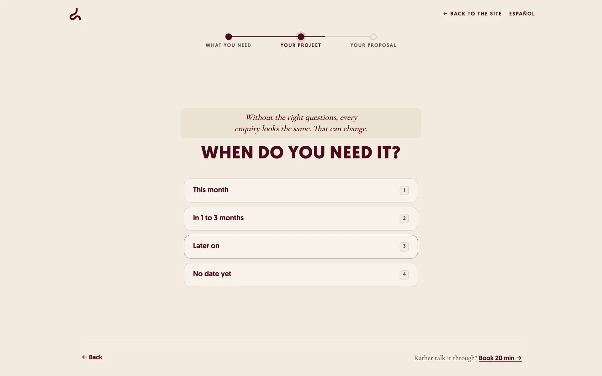
| When do you need it? | It’s purchase intent, asked as help. | We tell them which months they’d have it. |
It used to be five. We removed “What do you sell?”, which changed nothing on screen, and the budget question, for the reasons below. Every question has to change something the person sees or something you use. Otherwise it goes.
Seven rules for qualifying without scaring people off
1. Say how long it takes and what they get
The first screen says “Three questions. At the end we’ll tell you what fits and what it costs”. The longer a questionnaire is announced to be, the fewer people start and finish it, and the last answers get faster and worse (Galesic and Bosnjak, 2009). Announcing a result also sparks curiosity. Just only promise what you deliver.
2. What matters, first
What they want and what’s wrong go at the start, for the same reason: answer quality drops as the form goes on. Personal details go last.
3. Ask about their problem and show you read it
When someone picks “I get enquiries, but can’t tell who’s serious”, the next screen replies to that: “Without the right questions, every enquiry looks the same. That can change.” Feeling heard makes people like a conversation more (Huang and colleagues, 2017). That it works the same way in a form is our hypothesis, and we measure it.
4. Don’t ask for the budget: show the price and ask if it fits
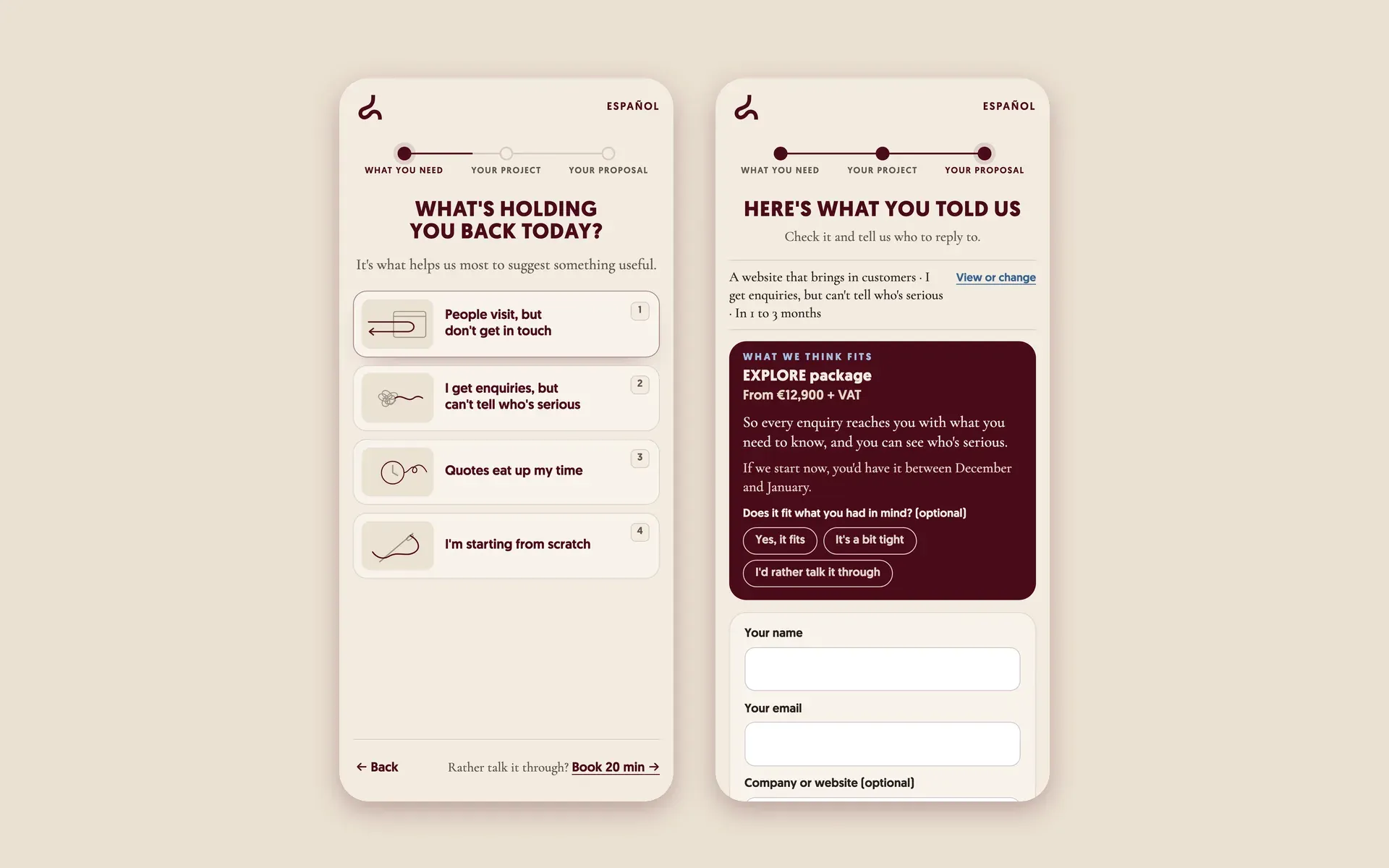
“How much do you want to spend?” puts people off, especially in B2B: nobody wants to say €15,000 and get quoted €15,000. Instead, at the end we show the proposal with its starting price and ask, optionally, whether it fits: “Yes, it fits”, “It’s a bit tight” or “I’d rather talk it through”. You learn the same without them revealing anything.
Hiding the price also breeds distrust and makes the product feel out of reach (Nielsen Norman Group). Not seeing the total cost upfront is one of the most cited reasons for abandoning online purchases (Baymard).
5. Make the options depend on what they already said
Someone who wants a new website doesn’t have the same problem as someone who wants a configurator. So the options in “What’s holding you back today?” change with the previous answer. Options that don’t cover their case force them to pick one that isn’t true, and that’s bad data (Krosnick and Presser, Question and Questionnaire Design, 2010).
6. Few personal details, at the end, with a reason
Name and email once they’ve seen their proposal. Company or website is optional, with the reason next to it: “So we can take a look before we talk”. The phone isn’t in the form; it’s offered after sending, for those who prefer a call. In a published test, adding a phone field cut conversion by 36.9%, even though it was optional (NextAfter).
Careful with “fewer fields is always better”. In another test, the shorter form brought 14% fewer leads (Michael Aagaard). A useful question, to someone who really wants to buy, may not cost you anything.
7. No tricks
No progress bars that crawl at the start (they increase drop-off, according to a meta-analysis of 32 experiments by Villar, Callegaro and Yang), no fake “calculating your proposal” waits, no invented urgency, no guilt-tripping people who leave. They work for a day and cost you trust.
What reaches us
When someone sends the form, the notification arrives with what decides the call, at the top and in this order: what they want, whether the price fits, when, and their website. We also know which page they came to the contact from, with no personal data. With that, the first call takes 20 minutes and gets straight to the point.
When a form isn’t enough
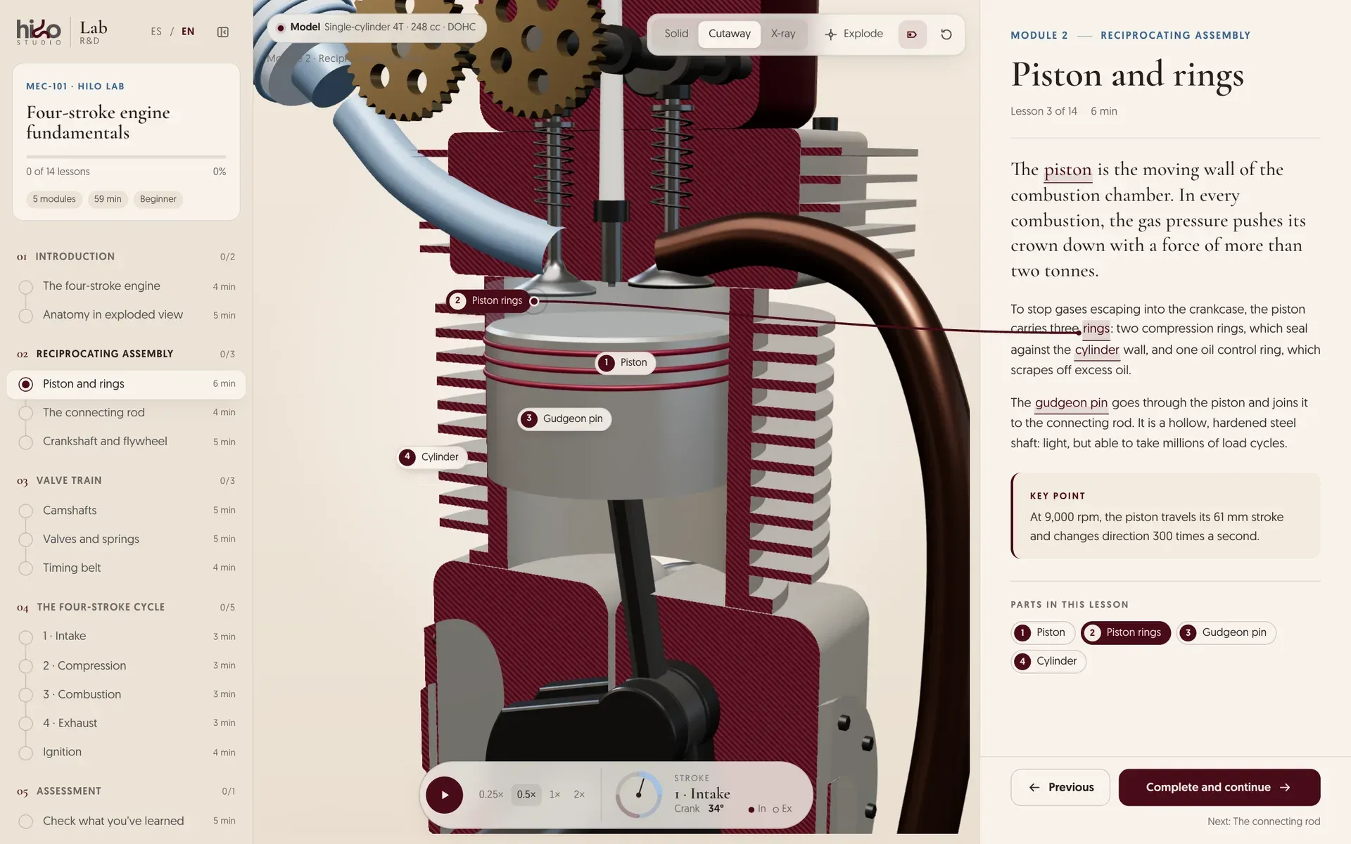
A form qualifies with what people can put into words. But for some products customers don’t know what to ask for until they see it: a padel court with its turf and lighting, a sofa in its fabric, a renovation with its measurements. There, qualification lives inside a tool: a configurator, a planner or a quote calculator.
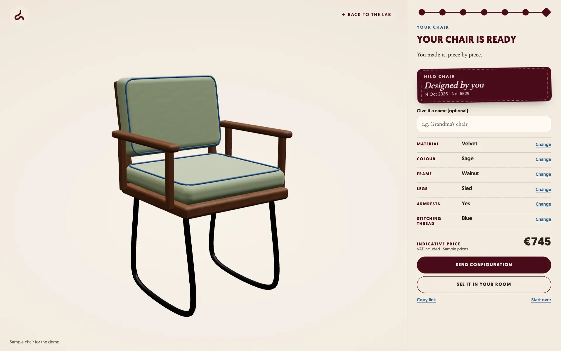
In the padel court configurator, customers build their court, see how many fit in their building and send the configuration. The manufacturer gets a request that already says what they want, in what space and with what budget. It’s the same idea as our contact form, taken one step further.
Want your website to bring you leads that are serious?
Let's talk →